
COMMENTS ON THE ART MARKET
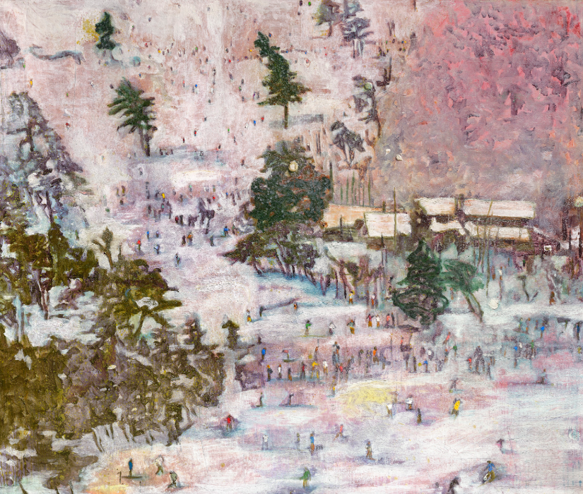
Upcoming Exhibition – Sweet Treats
Opening August 22nd
We’re excited to announce our upcoming exhibition, Sweet Treats — a playful and indulgent showcase featuring a delectable collection of works by today’s leading contemporary realist artists.
This year’s show welcomes the return of Jay Davenport, who brings his signature wit with Crime Scene. Also featured are whimsical delights from Stuart Dunkel, confections by Beth Sistrunk and Timothy W. Jahn, a hyperreal gem by Cesar Santander, masterful illusions by Joel Carson Jones, and many more.
Join us on Thursday, August 22nd, for opening day — we’ll be serving fresh gelato courtesy of Solato. Come by, grab a scoop, and treat yourself to some seriously sweet art.
Stocks & Crypto
It has been quite a busy month over here, between prepping for art fairs in Seattle and Newport, to actually traveling to both fairs in back-to-back weeks, to straightening up the gallery upon our return – with that, I have not paid as much attention to the daily news churn as I usually do. So, I’m going to keep this one a bit shorter and less ranty than months past.
The major US stock indexes exhibited some volatility, though all three landed in the green for July… The Dow was nearly even for the month with a 0.1% gain, while the S&P and NASDAQ notched 2.2% and 3.7% gains, respectively. That said, we ended the month off on a cool streak with three consecutive days of losses after setting some fresh records. While tech stocks are buoying the look of things overall, it seems there is a reasonable level of concern among investors. I know I keep hammering the same points, but inflation remains elevated (which curbs expectations of a September rate cut), on top of the fact that the Fed kept rates unchanged for a fifth consecutive meeting (despite strong pressure from the current admin to cut rates). Additionally, the seesaw application of tariffs continues to make it difficult for other countries and corporations to plan for the future. Looking back to June, a strong Jobs report eased some recession fears, but as I’m writing this, Trump just directed the firing of the commissioner of the Bureau of Labor Statistics because the July report contained “larger than normal revisions to data from May and June.” The July report showed the US economy added fewer than expected jobs, while the unemployment rate rose… and again, notably, there were major revisions to the previous couple of months – May job gains were revised from 144,000 to 19,000, and June was revised from 147,000 down to just 14,000. Those figures are dramatic, but it’s important to understand that when they create these reports, they’re using modeling to make the best estimates, not collecting real-time data... from my understanding, these models do not produce such wildly incorrect numbers.
Looking at currencies and commodities… the Pound and Euro both slid through July, meaning the US Dollar strengthened in relation for the first time in months. The Pound weakened 3.3% while the Euro weakened 1.6%. Initial expectations were the opposite, but a trade deal with Europe has eased concerns of a trade-war escalation… and with so much speculation in the market these days, traders who were betting on a rising Euro were squeezed to the point of closing out their positions. Crude continues to trade in the mid-to-high 60s, brandishing a 2.7% gain for the month, while gold sits perched at the lofty levels we’ve seen the past few months – it’s up another 2.3% in July, and more than 30% this year!
In the crypto world, we saw some positive movement… Bitcoin is back to all-time highs – for the first time, it topped $120K, maxing out at more than $123K. It’s pulled back a bit and is now trading closer to $113K, but I don’t think anyone’s complaining – it’s up about 7% for July. Ethereum is absolutely blazing, with a 45% gain for the month as it clawed back above $3k… it is now sitting in the $3.5K ballpark. Litecoin also had a nice showing, with a 28% gain, though it is still a far cry away from the records back in 2021, when it was approaching nearly $400.
Looking ahead, I think there are still a lot of volatility concerns for the coming months… obviously, there is an ever-evolving trade policy to keep an eye on, as well as stubborn inflation and other metrics. Not to mention, when you mix in unreliable statistics and data about the state of the economy, it makes it incredibly difficult to make informed decisions. So much for keeping this short… anyway, hope you’re all having a nice summer!
Tales From The Dark Side
Stolen Madonna Returned
Madonna & Child
by Antonio Solario
Back in March, I wrote about how a woman in Britain refused to give up her Renaissance-era Madonna & Child painting, which investigators concluded had been stolen fifty years ago. However, the standoff has now come to an end, and she has willingly returned the work.
Madonna & Child by Antonio Solario was stolen in 1973 from the Belluno Civic Museum in northern Italy. While it was not the only work of art stolen from the museum, for decades it remained one of the few works that had not been recovered. It has only been in the last several years that investigators were able to narrow down the Solario’s location. They tracked it down to East Barsham Manor, an old English country house in Norfolk about an hour northwest of the city of Norwich. The home is owned by Barbara de Dozsa, whose husband had bought the painting shortly after its theft. After her husband died in 2017, she tried to consign it to a nearby auction house, which caught the attention of the relevant authorities. When prompted, De Dozsa refused to surrender the painting, stating that her husband had purchased it in good faith. While not exactly the best response from a moral or ethical standpoint, this is a perfectly serviceable legal defense. Under British law, you become the legitimate owner of a stolen work of art if you bought it in good faith and have been in possession of it for at least six years. However, De Dozsa’s defensiveness was somewhat confusing for many. She previously confessed that she does not display the Solario on the walls of her house and that she doesn’t even like the painting. Furthermore, there would be no benefit in holding onto it. Art lawyer Christopher Marinello acted as an intermediary in an attempt to persuade her to surrender the painting voluntarily. He commented, “While the UK Limitations Act certainly supported her position, the fact that the Solario was listed on the Interpol and Carabinieri stolen art databases meant that the painting could never be sold, exhibited, or even transported without the risk of being seized.” But now, after several years, De Dozsa is returning the painting to the Belluno Museum.
Marinello said that her decision “has restored my faith in humanity when so many possessors today of stolen artwork try to hold on to it. Despite the rights of the victim, people have no sympathy any more and she has proven otherwise.” The art division of the insurance company Generali agreed to cover the cost of packing and shipping the painting back to Italy, a decision that likely influenced De Dozsa’s choice. The Solario was turned over to the Italian embassy in London and arrived in Belluno on Monday. The museum will exhibit the work to the public until July 27th, displaying it alongside two other Madonna & Child paintings. Both are by the Renaissance painter Bartolomeo Montagna, and were both also stolen in the 1973 heist. The Solario will then undergo extensive restoration before being permanently returned to the museum’s collection.
The Art Market
Selling Princess Diana's Style

Julien’s Auctions presented Princess Diana’s Style & A Royal Collection, a major sale featuring 327 lots that honored the lasting elegance, compassion, and influence of Diana, Princess of Wales. More than a fashion icon, Diana used clothing to express herself and connect with people. Her style choices were never just about  appearance; they often carried deep meaning, reflecting her values, emotions, and role as a modern royal. This collection gave bidders a rare chance to see the personal side of Diana through the clothes and accessories she wore during important public and private moments.
 The auction featured a diverse range of pieces, from formal gowns to everyday accessories, many of which drew strong interest and elicited high bids. Several standout lots featured matching Rayne shoes and handbags—a luxury British brand. A red leather clutch and shoes worn during visits to Japan, Canada, and the UK sold for $91,000, far above the $4,000–6,000 estimate. A peach leather set worn at London’s Langham Hotel in 1991 sold for $45,500, and a magenta set from a Canadian visit brought in $52,000, well above expectations. A peach straw hat by John Boyd, worn during Diana’s honeymoon send-off in 1981 and again in 1983, sold for $26,000, just above the low end of its $20,000–40,000 estimate.

Several dresses proved to be major highlights of the sale. The well-known “Caring Dress”—a floral day dress by Bellville Sassoon that Diana often wore while visiting hospitals and charities—sold for $520,000, surpassing its $200,000–$ 300,000 estimate. A bright yellow floral two-piece outfit by Bruce Oldfield, worn to Royal Ascot in 1987, also exceeded expectations, selling for $260,000. One of the most memorable pieces in the auction was the cream silk “Falcon” gown by Catherine Walker, created for Diana’s 1986 tour of Saudi Arabia. Embroidered with gold falcons to honor the local culture, the gown is a powerful example of Diana’s thoughtful approach to fashion and diplomacy. It sold for $455,000, again above the $200,000–300,000 estimate.
Each item in the sale came with photographs, books, or press documentation, adding to their historical value. Together, these pieces told the story of a woman who used fashion to transcend tradition, connect with people, and shape the world’s perception of royalty. A portion of the proceeds from several lots will benefit Muscular Dystrophy UK, continuing Diana’s legacy of care and public service.
Classics Week: Christie’s Old Masters Evening Sale
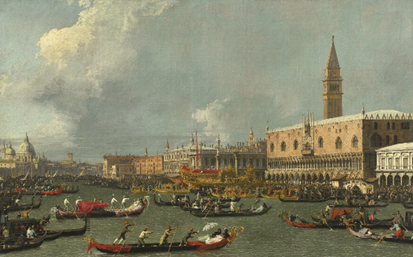
The Return of the Bucintoro on Ascension Day
by Canaletto
On Tuesday, July 1st, the major London auction houses started their Classics Week with the Old Masters evening sale at Christie’s. Industry publications have been discussing the sale for months, particularly due to an eighteenth-century Venetian cityscape by the acclaimed Italian painter Giovanni Antonio Canal, popularly known as Canaletto.
Canaletto’s work is incredibly popular at auction, with some of the larger examples fetching millions. The work offered at Christie’s was estimated to sell for around £20 million. The reason for the exorbitant price is not only due to the artist and the subject (The Return of the Bucintoro on Ascension Day) but also the provenance. The painting’s first recorded owner was Sir Robert Walpole, a prominent Whig Party politician who served as the United Kingdom’s First Lord of the Treasury. His influence over policy and the leadership of his party have led historians to refer to him as the country’s first Prime Minister. The painting was most likely created sometime in the 1730s, but it would not come into the Prime Minister’s possession until the 1750s when he displayed it at his residence at 10 Downing Street. The painting remained in the family’s collection until 1930, which Christie’s attributes as one of the reasons why the work is in such good condition. The house specialists say that this is the artist’s earliest known representation of this particular subject. The Bucintoro was the barge used by the Doge, the elected leader of the Republic of Venice chosen from among the city’s powerful mercantile families. Every year on the Feast of the Ascension, celebrated exactly thirty-nine days after Easter, the Doge would sail on the Bucintoro out of the Venetian Lagoon and into the Adriatic Sea. There, he would perform a ceremony called the sposalizio del mare, or the marriage of the sea, throwing a gold ring into the water to symbolize Venice’s connection to, reliance on, and dominance over the ocean. The Doge would perform the ceremony every year until 1798. The city revived the ceremony in 1965, which is now conducted annually by the mayor. The example offered at Christie’s on Tuesday is, according to the house specialists, “a supreme example of Canaletto’s early maturity.” The painting ended up surpassing the expectations of Christie’s experts, climbing above its estimate and hammering at £27.5 million / $37.8 million (or £31.9 million / $43.9 million w/p). With that price, it greatly superseded the Grand Canal cityscape sold at Sotheby’s in 2005 for £18.6 million w/p, making it the most expensive work by the artist ever sold at auction.

A pie on a pewter plate, a partially peeled lemon, etc.
by Jan Davidsz. de Heem
There were several multimillion-dollar lots available at Christie’s that day. Far behind the Canaletto but still in second place was a 1649 still-life painting by the Dutch Golden Age artist Jan Davidsz. de Heem. In contrast to other examples of still-life paintings from the period, De Heem presents an incredibly vibrant work, showcasing a sumptuous feast laid out on a table. While backgrounds in this period are often just gray or beige walls, the artist gives us a more luxurious work by adding curtains in the background and drapes blanketing the table. Among the objects depicted are pewter and silver cups and pitchers, a blue and white Chinese porcelain bowl, oysters and nuts, lobsters, shrimp, and crayfish, a basket of fruit, and a partially eaten pie with its contents exposed to the viewer. Considering the vibrant colors and excellent condition, Christie’s specialists assigned an estimate range of £3 million to £5 million. The enthusiasm for the painting was rather lackluster, garnering a few bids to bring it up to the minimum estimate before the auctioneer, Henry Pettifer, brought the hammer down at £3 million / $4.1 million (or £3.67 million / $5 million w/p). This price made the painting the fourth most-expensive painting by Jan de Heem to ever sell at auction, and the second most expensive from just this year, with a magnificent floral still-life selling at Sotheby’s New York this past May for $8.8 million w/p as part of the Saunders Collection.
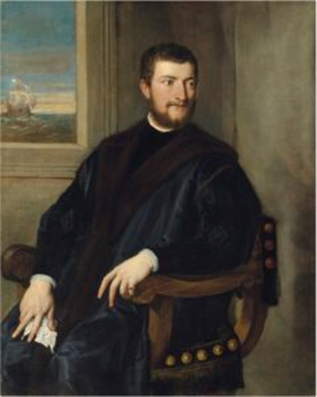
Portrait of a Nobleman
by Titian
And finally, later on in the sale was Titian’s Portrait of a Nobleman, which was only rediscovered after its appearance at auction in 1976. The painting’s subject has not yet been identified, but the ship seen out on the open ocean through the background window may indicate that the sitter comes from a wealthy background involved in trade or commerce. The subject also wears a ring and holds a kerchief in his left hand, which some specialists interpret as a sign of mourning for a wife or other romantic interest. The dating of the painting is still up for debate, but many scholars have given a broad guess to the 1540s or 1550s. Despite the quality and the authorship, interest in the Titian was not as strong as expected. With the same estimate range as the De Heem, the Titian portrait sold for £2.8 million / $3.8 million (or £3.4 million / $4.7 million w/p).
In the end, the sale did exceptionally well, with seventeen of the thirty-nine available lots selling within their estimates, giving Christie's use a 44% accuracy rate. An additional eleven lots (28%) sold below, while six lots (15%) sold above. With five lots unsold, the auction itself achieved a sell-through rate of 87%. Normally, with Old Masters sales, even the major auction houses are lucky if the final price meets the minimum total estimate. On Tuesday evening, however, the sale achieved a total hammer amount of £46.2 million (or $63.5 million), slightly short of the £47.98 million high estimate. Even if the Canaletto had sold at its initial estimate of £20 million, the auction as a whole would have still reached its total estimate range.
Sotheby’s New York Modern Discoveries
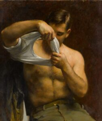
Man Putting on His Shirt
by John Koch
On Wednesday, July 16th, Sotheby’s New York hosted their Modern Discoveries online sale, featuring ninety works of art primarily by nineteenth- and twentieth-century European and North American artists. Normally, I would not pay any attention to this sort of auction. The paintings are nice enough, but I was very interested in what became the top lot. Among the post-impressionist landscapes and bronze sculptures, there was Man Putting on His Shirt by John Koch. The artist may not be the most well-known of the early twentieth-century American realists, yet his urban interiors and other looks at mid-century life have caught the attention of certain collectors. The three paintings by the artists available at Sotheby’s on Wednesday, however, are rather different. All of them are rather intimate, showing men in various phases of undress, ranging from workers resting shirtless in a field to a man in a bathing suit playing with a child. Man Putting on His Shirt is probably the most intimate of the three. The painting is somewhat erotically charged, with the subject’s raised arms framing his exposed torso. This is not unusual for some of Koch’s paintings, which led some of his contemporaries to question his sexuality. Sources conflict on this matter, with some claiming that the artist was indeed gay but closeted, while others say that he was happily married to his wife Dora for nearly fifty years. Regardless, the last time Man Putting on His Shirt sold at auction was back in 1996, when it sold at Christie’s for $17.8K w/p. Sotheby’s specialists did not expect the painting to do much better than that, assigning it an estimate range of $8K to $12K. From the moment the lot opened, the Koch received considerable attention. By the time the clock ran out, the hammer price had skyrocketed, surpassing the high estimate by a factor of 25. The Koch eventually sold for $300K (or $381K w/p). This makes the painting the third most expensive work by the artist to ever sell at auction.

Blue Lake
by Sergei Vinogradov
Behind the Koch was a landscape by the Soviet painter Sergei Vinogradov. Blue Lake shows exactly that: bright blue water, only interrupted by tall grasses and water lilies, stretching to the opposite tree-lined shore. Vinogradov was a Russian impressionist painter who was also associated with a group known as the Peredvizhniki, or the Wanderers. These were Russian realist painters who actively opposed the conservatism of the Imperial Academy of Arts in Saint Petersburg. These painters often focused on landscapes and scenes of everyday life. Blue Lake also proved incredibly popular with Sotheby’s buyers, selling far beyond its $30K maximum estimate. It eventually sold for $140K (or $177.8K w/p), or more than four-and-a-half times the high estimate. And finally, a bit of sculpture came in third place with Auguste Rodin’s Mouvement de danse, étude type A, agrandissement. The work is part of a series of sculptures Rodin executed in the last decade of his life, showing dancers in various poses, achieving the difficult task of making a static object appear fluid and dynamic. Rodin created the design for this particular sculpture around 1911. However, Rodin’s estate would not have it cast until 1958 as one of ten copies. While the other top lots sold exponentially beyond their high estimates, the Rodin sold for a more reasonable price by comparison. Sotheby’s expected the Rodin to sell for between $60K and $80K, with several interested bidders raising the final price to $130K (or $165.1K w/p) before the online timer ran out.

Mouvement de danse,
étude type A, agrandissement
by Auguste Rodin
There were a handful of other lots that sold for more than twice their high estimates, including one of the other Koch paintings, Farmers Nooning, which sold for $28K against a $10K high estimate. The sale overall did exceptionally well. Of the ninety-five total lots, thirty sold within their estimates, giving Sotheby’s a 32% accuracy rate. Twenty-six lots (27%) each sold above and below their respective estimates. This left thirteen lots unsold, giving Sotheby’s an 86% sell-through rate. Against the $1.2 million total low estimate, the auction achieved a total hammer of $1.76 million (or $2.24 million w/p). Even if the Koch and the Vinogradov had not sold exponentially above their estimates, the auction’s total would have still fallen within the pre-sale total.
Deeper Thoughts
Raphael Rooms Renovated
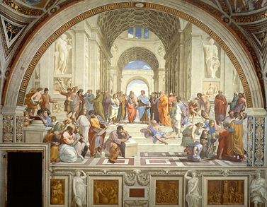
The School of Athens
by Raphael
After nearly a decade, all four of the Vatican’s Raphael Rooms have been completely restored, with some surprising discoveries made along the way.
The Raphael Rooms are a series of rooms in the Apostolic Palace, the pope’s official residence at the Vatican. They are so named because Pope Julius II commissioned the Renaissance artist Raphael to paint a series of frescoes as decoration for what he intended to become his apartments. Some believe that he commissioned Raphael to do this so that his living quarters could be more opulent and spectacular than those of his predecessor, Pope Alexander VI. For nearly ten years, conservators have been delicately cleaning and restoring the frescoes, with the team removing the scaffolding in the Sala di Costantino on June 26th. Most of the paintings show biblical scenes or episodes from church history. The most famous of the frescoes is the School of Athens, a group portrait depicting numerous classical, pre-Christian philosophers and scientists. Raphael used the likenesses of his contemporaries for these figures. For example, Plato stands in the center with the face of Leonardo da Vinci. The architect Donato Bramante appears rather appropriately as Euclid, while the philosopher Heraclitus is seated on the steps, looking like Michelangelo. Raphael himself makes an appearance on the far right, with many positing that he represents the ancient Greek painter Apelles.
During the restoration process, conservators discovered that Raphael had been experimenting with new techniques in creating the frescoes. Typically, when creating a fresco, an artist first applies a thin layer of wet plaster onto which they will then add the paint. This is primarily for durability, as the paint and plaster dry simultaneously. The paint, therefore, becomes part of the wall rather than a layer on top of it. Just a few buildings over, Michelangelo used this technique extensively in painting the Sistine Chapel’s ceiling. Raphael, however, was experimenting with ways to apply oil paint directly onto the walls of the pope’s apartments. Some of the paintings are indeed made from oil paint applied directly to walls, such as the allegorical figure of justice. The restoration team revealed how the artist accomplished this by looking at scans of some of the walls. Beneath the paint and the plaster on some of the frescoes, specialists discovered a series of nails arranged in a grid pattern. Conservators theorize that these nails were intended to hold a layer of natural resin in place, onto which Raphael would apply the paint. This would have been an experimental, radical technique, one that, unfortunately, the artist never got to use extensively, as seen by the eventual use of plaster. Raphael never got to complete the rooms himself, dying at the age of 37 in 1520. His apprentices and students, like Giulio Romano and Gianfrancesco Penni, completed the remaining work. However, with the confirmation of Raphael’s technical experimentation, the figures painted directly onto the wall can be positively attributed to Raphael rather than his students.
While the Raphael Rooms have never been fully closed during their restoration, the thousands of visitors drawn to the Vatican for the 2025 Jubilee will now be able to see all four rooms unobstructed by the restoration work.
Crown of Throns At The Pantheon
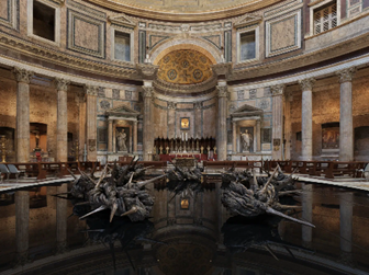
Corona Gloriae
by Helga Vockenhuber
A giant sculpture in the shape of the Crown of Thorns has been placed in the center of the Pantheon in Rome.
Corona Gloriae, created by the Austrian sculptor Helga Vockenhuber, was unveiled on Wednesday, July 2nd, at the Pantheon. While the Pantheon is known among tourists as an ancient temple to all the gods of Rome, it is also the site of the oldest Catholic church in the city, the Basilica of Santa Maria ad Martyres. The installation consists of seven bronze sculptures that, when arranged together, form a broken crown of thorns. It is meant to evoke the story of Christ’s Passion and symbolizes suffering and redemption. However, the crown is broken, symbolizing the ability to overcome suffering and the hope that the idea of redemption inspires. But the crown also symbolizes martyrdom itself, making it an appropriate installation for a major Catholic church dedicated in part to all Christian martyrs. However, the sculpture also interacts with the building itself in an interesting way. The ring of twisted, thorny sculptures has been placed directly beneath the Pantheon’s oculus, a central opening that faces skyward. The sun, therefore, shines directly over the sculpture exactly at noon.
Vockenhuber’s earlier version of the sculpture was exhibited at the Basilica of San Giorgio Maggiore at the most recent Venice Biennale. The two curators who oversaw the installation in Venice, Father Umberto Bordoni and Professor Giuseppe Cordoni, have returned to supervise its exhibition at the Pantheon. The awe-inspiring installation was made possible through the collaborative efforts of the City of Rome National Museums Directorate, the Austrian embassy to the Vatican, and the Catholic Church’s Dicastery for Evangelization. This work is one of many cultural initiatives undertaken for the Church’s Jubilee Year, with the theme of hope resonating particularly well with this piece. In fact, the central idea of hope is one that many will need this year. In a time when the world seems to be delving deeper into chaos, hope is often all one has.
Corona Gloriae will be on display at the Pantheon until September 16th.
Untitled (America): The Whitney Asks What Makes Art American?
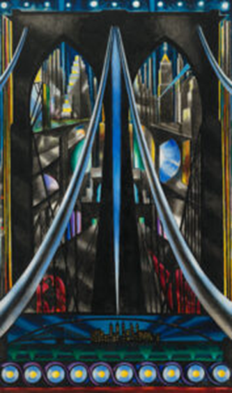
Brooklyn Bridge
by Joseph Stella
On Saturday, July 5th, the Whitney Museum of American Art in New York unveiled its latest exhibition, Untitled (America). The show presents an opportunity for the museum to showcase many of its collection highlights, with a subtle goal of defining American art.
Upon exiting the elevator onto the seventh floor, viewers are greeted by several iconic museum highlights, including Summer Days by Georgia O’Keeffe and Three Flags by Jasper Johns. They serve as a little appetizer for what’s to come. The Johns, of course, is an iconic rendering of an equally iconic American symbol, standing in for the exhibition’s subject. The O’Keeffe, however, represents one of the main topics the Whitney curators try to address: America as a physical place. Throughout her work, O’Keeffe made great use of the flora, fauna, and landscapes of the American Southwest. The United States and the continent of North America itself are so diverse in terms of climate and the ways humans choose to live alongside one another. City life formed a key part of the exhibition. Several paintings by Edward Hopper, such as Early Sunday Morning, as well as Brooklyn Bridge by Joseph Stella and Pittsburgh by Elsie Driggs, offer glimpses into quintessentially American urban life, from the smoke of industry to the bright lights of skyscrapers to dozens of businesses and storefronts lined up one by one down broad avenues. However, it is challenging to separate the physicality of the American experience from another key theme highlighted by the Whitney, namely Black American experience.
The culture and identity that developed among Black Americans is unique to this continent, incredibly distinct from the constellation of European national and ethnic traditions transplanted to the United States. Having suffered the loss of the indigenous African cultures of their forebears, Black Americans, both before and after emancipation, sought to create something of their own. They drew from bits and scraps of West African, Indigenous, and white British and Irish cultures and folkways, creating something truly and authentically American. For example, Archibald Motley’s Gettin’ Religion depicts a nighttime street on the South Side of Chicago, where people are dancing and celebrating to the sound of jazz played by a handful of instrumentalists. European instruments interpret echoes of African musical traditions filtered through spirituals and work songs. Jacob Lawrence’s War series was also present in the galleries, depicting the experiences of Black veterans during the Second World War in a way that evokes the aesthetics of African folk art. Of course, Jean-Michel Basquiat makes an appearance with his Hollywood Africans, a commentary on the limited and demeaning cultural depictions of Black Americans. And Barkley Hendricks’s life-size, full-length portrait Steve not only showcases contemporary Black fashion of the 1970s but also serves as a sort of predecessor to Black American realist painting now being pioneered by the portraitist Amy Sherald.

White Crush by Buck,
exhibited at Rehs Contemporary’s
Art of Subversion
Of course, it wouldn’t truly be an exhibition on American art without including twentieth-century consumerism and the subsequent genre of pop art. While Andy Warhol’s Campbell’s Soup Can series is probably the artist’s most iconic work, his Green Coca-Cola Bottles presented in the Whitney galleries is perhaps more representative of the consumer culture the exhibition curators sought to convey. Still Life with Crystal Bowl by Roy Lichtenstein and Large Trademark with Eight Spotlights by Ed Ruscha also serve as stand-ins for twentieth-century American mass culture transformed into an accepted form of high art. The distinction between fine art and decorative art often hinges on function. I mentioned this over a year ago when a museum in France proposed changing its name to better reflect that it also showcases decorative art, folk art, and archaeological artifacts. However, an object having a functional purpose does not necessarily deprive it of its aesthetic qualities that would make it the recipient of admiration in a gallery setting. We saw this firsthand during our own Art of Subversion exhibition last year, part of which included functional glass sculpture. Many of the pieces have a practical use, yet their aesthetic qualities are so evident that the craftsmanship and artistry can often overtake the practicality. That is the essence of pop art, and it has since become a cornerstone of modern American art.
The Whitney Museum is dedicated to American art and serves as a platform for contemporary artists. But aside from the nationality of one artist or another, what makes some art distinctly American? The title of Untitled (America) is borrowed from an installation work by Felix Gonzalez-Torres. Many visitors to the Whitney have probably seen and taken little to no notice of it. The work consists of twelve strings, each with forty-two lightbulbs. Part of the piece’s uniqueness lies in the fact that the artist left no instructions for curators, allowing it to be displayed in any manner that the exhibitors see fit. With even the slightest change, anyone who handles it creates a new version of the artwork. On my previous visits, Untitled (America) was hanging in the main museum stairwell. But for this exhibition, part of it was displayed by a window facing the Hudson River. A significant portion of the string was coiled up on the floor, light bulbs aglow like a luminescent bird’s nest. One of the installation’s meanings, which also lends itself to the entire exhibition, is that defining what is and is not American is so nebulous. There are as many interpretations of what is American as there are ways to hang a string of lights. Or, as the artist put it, America is “an unattainable dream”. And just from the museum highlights alone, the Whitney is able to create a cross-section of American art, focusing on a handful of key themes. But of course, the topics covered by Whitney curators barely scratch the surface of what it means to be American, whether it’s a person or a work of art.
Bayeux Tapestry Returns Home
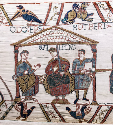
A segment of the Bayeux Tapestry,
showing William the Conqueror
in the center alongside
his half-brothers Odo and Robert
After over nine hundred years, the Bayeux Tapestry will return to England as part of an exchange between the British and French governments.
The Bayeux Tapestry is a centuries-old document that depicts the events surrounding the Norman conquest of England in 1066. The English king, Edward the Confessor, died without an heir, leading to several claimants. William, Duke of Normandy, was the king’s first cousin and believed the English throne was rightfully his. However, the Witenagemot, the Anglo-Saxon council of the nobility, chose a new king from amongst themselves, elevating the Earl of Wessex, Harold Godwinson, to the throne. The Normans crossed the English Channel, invaded the country, and killed Harold in battle. The tapestry ends with the Norman victory at Hastings, but most people know what happened after. William would be crowned at Westminster Abbey on Christmas Day of that year and would be forever known as William the Conqueror. Every king and queen of England, and later of Great Britain, is a direct descendant of his.
Confusingly, the Bayeux Tapestry is not a tapestry, nor was it made in Bayeux. It’s actually embroidery, and it was likely made in Kent in the southeast of England. It earned its name because it is kept at the Cathedral of Bayeux in Normandy. William’s half-brother Odo was Bishop of Bayeux and was likely the one who commissioned the tapestry’s creation. While it is an incredibly important artifact of both English and French history, for many centuries, the tapestry had only local significance. Every year, the bishop of Bayeux would unfurl the entire tapestry to decorate the cathedral for the Feast of Saint John the Baptist in June. It would not gain wider international recognition until it was exhibited at the Louvre in 1797. The first museum built to house and display the tapestry was established in 1913.
As part of a cultural exchange between the British and French governments, the Bayeux Tapestry will be lent to the British Museum to go on display between September 2025 and July 2027. Meanwhile, several artifacts from the British Museum, including artifacts from the Sutton Hoo burial mounds and the Isle of Lewis chess pieces, will be lent to French museums. The exchange was first proposed in 2017. However, with the global pandemic and two British prime ministers coming and going in the meantime, it has taken much longer than expected to get this arrangement off the ground. French President Emmanuel Macron and British Prime Minister Keir Starmer made the exchange agreement official at Windsor Castle on Tuesday. British Museum chairman George Osborne predicted that the tapestry’s exhibition “will be the blockbuster show of our generation”, similar to the contents of Tutankhamun’s tomb or when France sent the Mona Lisa around the world.
Some have commented that this sort of exchange involving incredibly famous and valuable artifacts may serve as a template for how the British Museum can let go of pieces with tainted provenances, such as the Parthenon Marbles. Organizations such as the Parthenon Project have suggested this sort of exchange in the past, proposing that the controversial sculptures taken from the Acropolis in Athens could be exchanged, even if temporarily, for any number of items that the Greek government could loan to the British Museum in turn.
Research Reveals Changes To Vermeer Street Scene
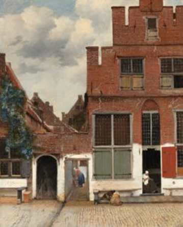
The Little Street
by Johannes Vermeer
Studies on a Vermeer street scene now reveal that the Dutch Golden Age master made significant alterations to the painting before its completion.
The Vermeer exhibition at the Rijksmuseum in Amsterdam was undoubtedly one of the art world’s highlights of 2023. With twenty-eight of the artist’s thirty-four surviving paintings in one place, it allowed both scholars and the general public to view most of his work in new ways. The exhibition featured some of his most iconic works, including Girl with a Pearl Earring, View of Delft, and The Geographer. The show required extensive cooperation between several major museums, including the Rijksmuseum, the Mauritshuis, the Metropolitan Museum of Art, and the Frick Collection. It also acted as a vehicle for collaboration between art historians and conservators. Recent research into Vermeer and his work has challenged commonly held assumptions about the artist. Many may understand Vermeer as a methodical and meticulous artist, one who rarely made major changes once he had composed a scene. Some even believe he used a special optical device to create his paintings. However, new research on some paintings shows significant changes. In September 2022, for example, scans on The Milkmaid showed various objects that are now missing from the completed work. In fact, we now know that about thirty of Vermeer’s paintings contain some form of alteration. And now, even after a year following the Rijksmuseum exhibition’s closing, the research conducted is still bearing fruit. The Rijksmuseum has published a book-length account of some of the research, titled Closer to Vermeer, which showcases some of the discoveries related to the painting The Little Street.
Johannes Vermeer completed The Little Street around 1658. It is one of only three paintings by the artist that are not interior scenes. The painting shows a house in the city of Delft as seen from the street. Several figures go about their business, with a woman in the doorway attending to her sewing. Meanwhile, a pair of children kneel over what is likely a game. The brick structures themselves are rendered with magnificent detail, with Vermeer using the slightest impasto to simulate the texture of the materials. It took until 2015 for researchers to pinpoint exactly where in the city Vermeer chose as his subject. Today, people can see a slightly newer building at 42 Vlamingstraat. The alleyway, occupied in the painting by a woman in red and blue, still exists and is sometimes marked by a facsimile of the woman in the painting. Vermeer’s perspective is that of someone looking across the canal that divides the street. Upon examining the archival documents, it makes sense that Vermeer chose these buildings for his painting since his aunt Ariaentgen Claes van der Minne owned the building on the right side of the painting. There, she operated a business selling tripe.
Tests conducted using a stereomicroscope reveal traces of pigments in certain parts of the painting, indicating that something else was once present. The scene’s initial composition was, therefore, rather different from the finished painting. Digital recreations of the painting before the alterations reveal that the playing children are missing, while the door is closed, and the sewing woman has been moved to the threshold of the alleyway.
Furthermore, several changes were made to the building’s window shutters. Rijksmuseum specialist Pieter Roelofs commented, “By literally opening the door, Vermeer makes the scene accessible to the viewer. These and the many other new discoveries in [Closer to Vermeer] paint a picture of a dedicated artist constantly striving to perfect his paintings.”
National Trust For France
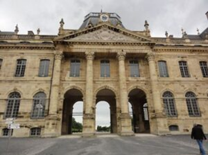
The Château de Lunéville,
maintained by the
Fondation du Patrimoine
France is considering the establishment of a new cultural organization, modeled after the National Trust in the United Kingdom.
The National Trust is technically a private entity but receives substantial support from the British government. The monarch is the organization’s patron, overseeing the preservation and conservation of historically and culturally significant land, structures, and other forms of tangible heritage. It is also well-funded, receiving over £720 million from 2023 to 2024 through donations, government grants, and millions of membership subscriptions. France is not lacking in cultural organizations, both private and governmental. But for a country that is as proud and protective of its national heritage as France, it may be surprising to some that they’re taking cues from the Brits.
The idea of forming a French equivalent of the National Trust was reportedly suggested by France’s Minister of Culture, Rachida Dati. It may not be very coincidental that such a suggestion would come after Emmanuel Macron’s state visit to the United Kingdom. During the president’s trip, British and French officials signed several cultural cooperation agreements. Not only will the countries’ respective cultural ministries work more closely despite Brexit, but the Centre des Monuments Nationaux has signed a declaration of intent to collaborate more closely with the National Trust, the National Trust for Scotland, and English Heritage. This would mainly be for “charitable and conservation principles” to promote best practice in several key areas such as “environmental and tourism sustainability practices in the interests of protecting the heritage, increasing its enjoyment and addressing the effects of the climate and biodiversity crises”.
Some are, however, rather confused about why Rachida Dati believes a French National Trust is necessary, since, from the perspective of many, France already has an organization like that. In 1996, Jacques Chirac’s government helped establish the Fondation du Patrimoine, an independent nonprofit organization that utilizes both public and private funds to protect French heritage. Although not as large and well-funded as its British counterpart, it nonetheless has a budget of over €100 million per year. However, it acts more as a custodian of historic sites rather than the outright owner of the properties like the National Trust in the United Kingdom. Furthermore, it has just under a hundred employees to oversee at least five hundred structures and other sites. They therefore rely heavily on volunteers. When speaking with the French newspaper Le Monde, the Fondation du Patrimoine’s president, Guillaume Poitrinal, responded to Dati’s proposal by saying, “The ‘French National Trust’ already exists, it’s us! The simplest way is to help us develop”.
The Fondation du Patrimoine mainly relies on volunteer work. Alexandre Giuglaris, the organization’s director, remarked that, previously, the volunteers were mostly retirees. “Today, they are much more qualified, skilled in specific aspects of protection.” However, this is not enough. Some have noted that France’s republican history may have influenced the way its people perceive their heritage sites. In Britain, common people are often eager to pitch in and help maintain a castle or an old country estate. Although they may not have noble blood or an aristocratic upbringing, they feel a stronger attachment to that world, as the monarchy remains a powerful institution in the country. France, on the other hand, made their feelings on monarchy well known when they cut off the head of Louis XVI. Julien Lacaze, director of the French organization Sites & Monuments, noted, “The state dreams of the English model where villagers act as guides and are proud of it. That’s not compatible in France.” This difference presents a challenge in maintaining French historic sites, which are significant generators of revenue through tourism. Perhaps a complete copy-and-paste method from the British model is not the most feasible approach. Instead, it may be better to ensure that existing cultural preservation groups have the necessary funding to hire more full-time employees to perform their duties more thoroughly and efficiently.
“I Could Do That”: Cattelan’s Banana & the Nature of Art

A recreation of The Comedian
by Maurizio Cattelan
Recently, a museum visitor made headlines when they ate a $6 million work of art. The Comedian by Maurizio Cattelan is the official title of the piece of concept art most people simply know as “the thing of the banana stuck to the wall with silver duct tape”. The work was on display at France’s Centre Pompidou-Metz when, on July 12th, a visitor went up and ate the banana. The museum quickly replaced the banana, having a supply of the fruit on hand, as Cattelan’s instructions included replacing the banana occasionally throughout its exhibition. This is far from the first time The Comedian has been eaten. When the work was displayed for the first time at Art Basel Miami in 2019, a performance artist named David Datuna took the banana off the wall and ate it in front of fair-goers. In 2023, a visitor to the Leeum Museum in Seoul, South Korea, did the same. And, perhaps most famously, the Chinese crypto figure Justin Sun bought a version of The Comedian for over $6 million at Sotheby’s, New York, before filming himself eating it.
Whenever The Comedian comes up in the news, all sorts of people will try to revive the horse they beat to death a long time ago in talking about the work’s meaning and the surrounding controversy. What does this mean for art? If you like it, does that make you pretentious? What is Cattelan saying about the market? Is connoisseurship dead? These are good questions, ones worth asking. But to a degree, they overcomplicate things. According to the Pompidou-Metz’s accompanying description, The Comedian is a commentary on the “absurdity of financial speculation and the fragility of knowledge systems that underpin the art market”. But to me, Cattelan’s Comedian is first and foremost a statement about the nature of art itself, and it serves as the perfect starting point for a conversation on the subject.
Among the many utterances that the casual museum-goer or gallery visitor might say that would make a connoisseur’s blood boil is “I don’t get it.” And that brings me to my preferred analogy about art appreciation: art is a two-way street. However, many view it as a one-way street, where an artist creates a work that conforms to seemingly objective aesthetic laws. An audience agrees or disagrees whether the work is indeed aesthetically pleasing, and that’s the end of it. However, art is so much more than that. It’s a two-way street, requiring some actual effort on the part of the viewer. If it were otherwise, a work of art would serve no more purpose than a nice pattern on wallpaper. Rather, a work of art is a text. It’s a document that needs to be analyzed, dissected, and interpreted, all of which leads to a person formulating their own opinion about it. But some people don’t see the need to put in that effort. They will stand in front of a painting by Rothko or Frankenthaler, dismissing it with an “Okay, so what? I don’t get it. I could do that.”
Nothing? It doesn’t do anything for you? You don’t want to do any work whatsoever? It doesn’t make you feel anything? It doesn’t evoke a memory or an image or any other sensory experience you may have had in the past? Dismissing a work of art by saying “I could do that” does a disservice to the artist. It reduces art to the physical, mechanical motions of creating something, completely divorcing art from the creative process that occurs in the mind. Anytime I hear someone say, “I could do that”, my standard response is always, “Okay, but did you?” That always confuses them, because they might have to admit that no, they didn’t, and they likely never would have been able to create something like this had they not just seen it now.
Cattelan’s Comedian is the perfect case study for these questions and discussions. The people who are the loudest in their dismissal, ridicule, and mockery are actually undermining their own point. Creating something aesthetically pleasing that serves as a strict recreation of nature is not the be-all and end-all of art. Art’s purpose is to provoke a response. The purpose of art is to make you think. And it doesn’t all have to be positive. A work of art doesn’t have to make you feel good. Saying otherwise is the equivalent of disliking a book because it doesn’t have a happy ending, or refusing to give a musician any credit because they make use of discord. The fact that you’re feeling anything at all about it means that it’s done its job. The British actor Simon Pegg recently shared how he showed his teenage daughter the David Lynch film Blue Velvet for the first time, and that he was thrilled when she thoroughly disliked it. “I was delighted that Tilly hated it because she talked about it nonstop that night and then the next day. And I said, sometimes entertainment is an overrated function of art.” When Cattelan duct-taped a banana to a wall in Miami years ago, he was not necessarily doing anything new or innovative. He was following in the footsteps of Dada and pop art, reinforcing a century-old idea: it’s art because we say it is. What more do we need than that?
Amy Sherald Cancels Smithsonian Show Over Censorship
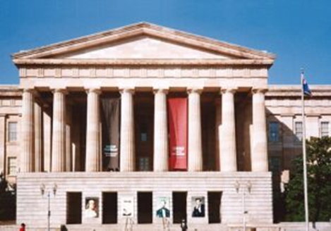
Smithsonian’s National Portrait Gallery
in Washington, DC
(photo courtesy of Ida Berger)
American portraitist Amy Sherald has canceled her upcoming exhibition at the Smithsonian’s National Portrait Gallery over censorship issues.
Earlier this month, I visited the Whitney Museum of American Art to attend the first day of their Untitled (America) exhibition. However, it took me longer than expected to exit the museum world, especially after her painting Miss Everything (Unsuppressed Deliverance) won the Outwin Boochever Portrait Competition sponsored by the National Portrait Gallery. This caught the attention of Barack and Michelle Obama, leading to the NPG commissioning Sherald to create the First Lady’s official portrait.
She also became known for painting the portrait of Breonna Taylor, the 26-year-old emergency room technician who was shot and killed in her home in Louisville, Kentucky, while police were executing a no-knock warrant. Her death became a pivotal moment in the wave of social justice protests that swept across the United States in 2020. It led to the prohibition of no-knock warrants first in the city of Louisville, then in several states, and then on the national level in March 2024. Meanwhile, the officer who shot and killed Taylor, Brett Hankison, was only recently sentenced to just shy of three years in prison for excessive use of force and violating her civil rights. Sherald painted Taylor in a beautiful dress with her left hand sporting the engagement ring that her boyfriend, Kenneth Walker, had planned on giving to her. The painting was featured on the cover of Vanity Fair and was exhibited at the Smithsonian National Museum of African-American History and Culture. On top of her standard portraits, she has also recently begun to execute more large-scale work, placing Black subjects at the center of iconic American images. For example, If You Surrendered to the Air, You Could Ride It shows a man sitting casually at the intersection of steel beams, referencing the 1932 photograph Lunch atop a Skyscraper. For Love, and For Country is both a Black and queer reinvention of the famous photograph V-J Day in Times Square, showing a sailor planting his lips onto a nurse to celebrate the Second World War finally ending. However, there is one painting in particular that Sherald says caused some discomfort at the National Portrait Gallery, enough for her to cancel the show entirely.
Trans Forming Liberty is a larger-than-life portrait, measuring over ten feet in height. It depicts a figure in a blue satin dress, striking a pose similar to that of the Statue of Liberty. The subject holds a torch filled with daisies, and, like Lady Liberty, appears barefoot, with one foot in front of the other. But Sherald’s portrait is full of modern color, like her bright pink hair cut into a bob, matching eyebrows, gold eyeliner, purple lipstick, and a lavender background. The title suggests that the subject is a trans woman. According to Sherald, this painting is the reason why she decided to cancel the show. It seems the NPG became hesitant to exhibit this work as it would likely cause a hostile reaction from the current presidential administration. The White House has already embroiled itself in a battle to unilaterally alter the mission and content of the Smithsonian Institution, and recently got into a row with the National Portrait Gallery, specifically after President Trump tried to fire its director. The artist wrote, “I entered into this collaboration in good faith, believing that the institution shared a commitment to presenting work that reflects the full, complex truth of American life. Unfortunately, it has become clear that the conditions no longer support the integrity of the work as conceived.’’
I understand the National Portrait Gallery’s concerns to a certain degree since fear of retribution has become a powerful force in our current political climate. But how can we look to the arts as a refuge from this fear and a bastion of free expression if the institutions meant to display and defend the arts can sometimes be willing to make compromises regarding the value and safety of marginalized communities?
Featured Artworks
Au Bois de Boulogne by Dietz Edzard
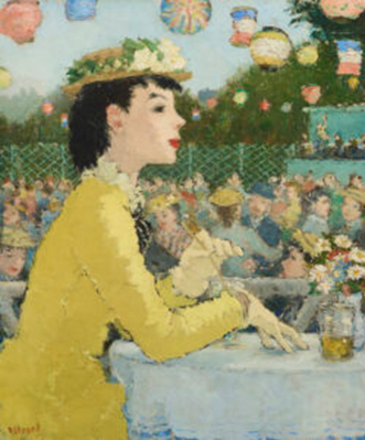 Au Bois de Boulogne by Dietz Edzard shows a young lady in a vibrant yellow dress enjoying herself at one of the cafés in the Bois de Boulogne, one of Paris’s large parks. The Bois de Boulogne is a popular destination for people of all classes and backgrounds. The park’s current borders were set in 1853 as part of Baron Haussmann’s urban renovation plans. At the time, it featured extensive spaces for walking and lounging, racetracks, cafés, lakes for boating, and, more recently, it is the home of the Stade Roland Garros, the venue for the French Open tennis tournament. It has also frequently become a subject for many artists like Béraud, Morisot, Bonnard, and Van Gogh. Many have also speculated that Édouard Manet used the Bois de Boulogne as the setting for his controversial work Le Déjeuner sur l’herbe, which some theorize is based on prostitutes catering to young bourgeois men in the park. But regardless of the interpretation, it’s undeniable that the primary theme of any work of art set in the Bois de Boulogne is leisure and recreation. And Edzard does not deviate from this established norm.
Edzard’s subject appears statuesque but with an Audrey Hepburn elegance. She is viewed in profile, with a calm, stoic expression, as she sips her drink. But while her gloved hand fiddles with her straw, another glass sits upon the table, perhaps implying the existence of a friend or a suitor opposite her. Her placid face makes it seem like she’s attentively following an anecdote or a piece of gossip. But while she remains still, the scene Edzard paints behind her is incredibly dynamic, showing countless couples dancing to the music provided by the small ensemble on the raised platform at the other end of the dance floor. While many painters have depicted café scenes, very rarely do we encounter a work set in a Parisian cabaret or café that is imbued with such intimacy. The action in the background coupled with the woman’s stillness creates a more engaging image for the viewer. The lady in yellow is just one of many attendees, but through Edzard’s framing, she becomes the star attraction.
Canal d’Ismaélich (Cairo) by Charles-Théodore Frère
 As I’ve written before, Orientalist paintings can sometimes prove problematic depending on the subject matter. However, despite the modern stigma against the genre, there are some historical artists whose work continues to endure, including Charles-Théodore Frère, the renowned landscape painter who captured the sun and sands of the Levant and North Africa without resorting to unnecessary exoticization.
Canal d’Ismaélich (Cairo) shows a group of women fetching water from the titular waterway, the Ismailia Canal, just outside of Cairo. The canal was originally dug in the 1860s to provide fresh water to Port Said to facilitate the Suez Canal’s construction. It connects the Nile and a pre-existing series of canals to Lake Timsah, running nearly one hundred twenty miles between Zagazig and Ismailia. Frère shows the canal with the minarets and towers of Cairo in the background, standing out against the setting sun. These sorts of scenes are some of the artist’s most iconic works, with the bright colors of the sun low in the sky rendered in a dazzling, painterly manner. It would likely be impossible to achieve such a strong command over light and color to create such scenes without traveling extensively in the region itself. Luckily, Frère was one of the few European artists who not only visited the Middle East and North Africa but actually lived there for a time, demonstrating his deep commitment to understanding and respecting his subjects. Frère operated a studio in Cairo for about a decade, joining the ranks of other Orientalist painters (such as John Frederick Lewis and Gustav Bauernfeind) who made an effort to better understand his subjects by living among them.
Capri by Ivan Fedorovich Choultse
 While Ivan Fedorovich Choultse is more well-known for his snow-covered landscapes and forest scenes, the present work is remarkably bright and sunny. Entitled Capri, the artist depicts a collection of cypress and mastic trees, along with other local flora, overlooking the rocky coastline that sinks into the blue Mediterranean waters below. It’s bucolic and pastoral, the view of a mainlander exploring the island for the first time and enjoying the sunbaked serenity. While other depictions of the Italian island may highlight the ruined Roman villas or the cliffside villages, Choultse places the island itself front and center, with the land and the sea as his primary subjects. Capri boasts numerous natural wonders, with the Blue Grotto being the most famous among them. But Choultse instead chose to pick what seems like a random spot on the coastline. It could be absolutely anywhere on the island. It therefore represents the island in a more well-rounded way than something singular.
Choultse may have been part of the School of Paris due to his status as a Russian emigrant, but stylistically, he differed greatly from the modernists. He received his artistic training from Russian and Ukrainian landscape painters such as Konstantin Kryzhitsky and Arkhip Kuindzhi. He had his work shown at prominent exhibitions in Saint Petersburg, with members of the imperial family buying his paintings. Choultse left Russia after the Revolution of 1917, fearing that his connections to the imperial court would jeopardize his safety. Although he was primarily based in Paris until his death in 1939, Choultse traveled extensively, mainly visiting and working in France, Switzerland, and Italy. The snow of the Alps or the shade of trees in the Forest of Fontainebleu may have been closer to his comfort zone. However, a warm Mediterranean island should have been a nice change of pace. Perhaps locales like Capri may have inspired his later move to Nice towards the end of his life. The trail along the cliff leads on, coaxing the viewer to step forward and venture on.
Allure of Parisian Architecture by Timothy W. Jahn
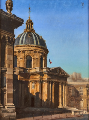 Timothy Jahn’s The Allure of Parisian Architecture marks a dramatic departure from the artist’s previous work. While Jahn has proven himself a most capable master of figure painting, still life, and, more recently, interior scenes, The Allure of Parisian Architecture is one of his few cityscapes. Upon receiving the painting, I was hit with a wave of memories from my first and only time in Paris. I had just left the Louvre one day in July, wandering around one of the several large courtyards formed by the palatial buildings. I exited through a large archway, which led to the Quai François Mitterrand and the River Seine when I saw a large dome building across the river. A French tricolor was perched atop the columned entrance while parts of the dome gleamed as if it were decorated with gold. I would later discover that it was indeed gold.
I snapped a photo, not knowing what I was looking at. I later realized this was the Institut de France, the country’s national academy. It contains the Académie des Beaux-Arts, which sponsored and judged the annual Salon for centuries. But perhaps more importantly, it oversees the Académie Française, the academic body that establishes and maintains the rules governing the French language. The French are incredibly proud of their language, so much so that unless you speak French at a native level, they will not use it to speak to you. They will just sigh and switch to English. So while the Eiffel Tower or I.M. Pei’s Louvre Pyramid may be more recognizable as some of the most iconic structures in the city, the gilded dome of the Institut de France may be more representative of the feel of Paris, its ethos, its attitudes. It is one of only three buildings in Paris that features 24-karat gold on its exterior, demonstrating its importance and place of pride among the French nation.
In Jahn’s painting, the building stands dignified as the sun rises behind the viewer, casting a golden glow upon its façade. Jahn displays an incredible command over color in this work, with the stone emerging from shadow and the dome’s gilded accents shining in the morning light. But Jahn also employs slightly looser brushwork here, omitting the finer details of the structures in the background in favor of a somewhat more impressionistic technique. It’s not something he does often, but it allows the audience to focus their attention on the intended subject. It distinguishes the work, transforming it from a purely accurate rendering of a building, no different from a photograph, into an artist’s approach to a beautiful subject.
Moulin de la Galette
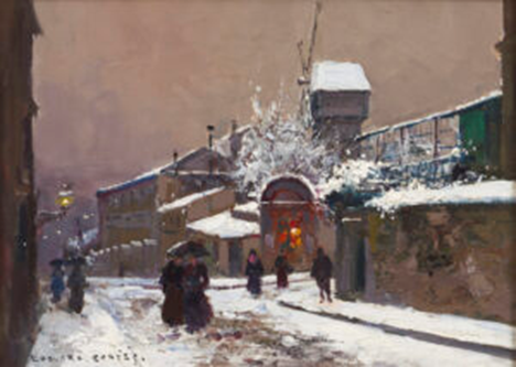
The Moulin Rouge is a popular and iconic Paris cabaret associated with windmills. But it’s not even a real windmill. The founders of the nightclub built a facsimile windmill on top of the building to emulate its famous predecessor, the Moulin de la Galette.
The Debray family initially operated a pair of windmills on the hill of Montmartre, where they milled flour and produced a form of brown bread that locals called a galette. The mills became popular for this bread, which they would serve alongside fresh milk. In the wake of the Napoleonic Wars, the family decided to set up a guinguette, a sort of tavern where they would serve local wine instead of milk. The establishment became popular with Parisians because the mills’ location outside the old city walls meant they were exempt from certain taxes on wine, allowing people to drink without spending too much. The addition of a dance floor in 1833 was the finishing touch that transformed a pair of windmills into the Moulin de la Galette, a place that not only served as a popular café and cabaret but also became a vibrant artistic hub. Since the nineteenth century, dozens of prominent artists have used the Moulin de la Galette as the central subject in their Paris cityscapes. They include Renoir, Van Gogh, Picasso, and Toulouse-Lautrec. And we happen to have two examples of our very own.
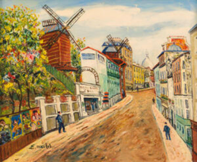
Moulin de la Galette
by Élisée Maclet
The Moulin de la Galette as shown by Edouard Cortès seems slightly bleak, but gives off a certain charm. The Paris streets are dusted with snow while pedestrians trudge along, protecting themselves with umbrellas. However, a light emanates from the club’s entrance. There’s another light in the form of a streetlamp, but the one coming from the doorway is warm and inviting. It’s as if it’s beckoning people to come out of the cold and enjoy themselves with some wine and good company. The same street as painted by Elisée Maclet, however, is entirely different. Working in a post-impressionist style similar to Maurice Utrillo, Maclet shows the Rue Lepic from the opposite direction, looking up the hill of Montmartre. The artist made sure to include both the windmills as well as the dome of Sacré-Cœur Basilica in the background, peeking out over the rooftops of houses. But regardless, the ubiquity of the Moulin de la Galette in Paris cityscapes across decades only serves to highlight its significance for the city and its artists.
Maya by Hiroshi Furuyoshi
 Hiroshi Furuyoshi’s Maya presents a young girl with a cello standing before an illustrious fifteenth-century tapestry. Based on some of the figures in the background, the work can be identified as The Fall of Tangier, one of the four Pastrana Tapestries commissioned by King Afonso V of Portugal in 1471. The tapestries depict the Portuguese conquest of several major cities in Morocco as part of their expansion into North Africa. The Portuguese would rule the city of Tangier for nearly two centuries after the tapestries’ creation. The king’s court painter, Nuno Gonçalves, designed the tapestries, while the finished product was created in the weaving workshops of Belgium. The Fall of Tangier depicts the city itself at the center, with two groups of figures positioned on either side. On the left is the invading Portuguese army. Meanwhile, on the right, the city’s residents are shown fleeing. This is consistent with the historical record, as when the Portuguese army drew closer to Tangier, many of the inhabitants fled. Asilah, another city conquered by the Portuguese, had had many of its residents killed or sold into slavery. The people of Tangier refused to meet the same fate.
The use of the Pastrana Tapestries as the background for this elegant, placid work creates a slightly jarring disconnect. The main subject is a girl looking out at the viewer, stoically holding a cello, evoking the beauty of the music the instrument provides. However, all that is set against a work of military art showing the violent conquest of entire cities by an invading army, the killing of civilians, and the enslavement of many more. It’s almost as if Furuyoshi is making a sort of statement about the importance of understanding context. Without the additional information, the background may seem like another tapestry you can see at the Met Cloisters. But once you learn about the atrocities it celebrates, you can never look at it the same again. This painting challenges us to confront the uncomfortable truth that some of the beautiful things we enjoy are often a product of centuries of violence and exploitation. And just like Maya, we sometimes feel compelled to turn our backs to it.
The Rehs Family
© Rehs Galleries, Inc., New York – August 2025